When I started my journey in photography I tried pretty much all the free alternatives for editing raw photos. But it just so happened that while I was stepping up my photography game, I had access to Adobe’s Lightroom through my workplace subscription. Therefore, I got used to using it for both work and my own company. And I loved it. I’ll be the first to admit, I do like Adobe’s products – However, I do not align with their philosophy regarding AI and pricing structure.
That’s why once I quit my old job, I started to look elsewhere for alternatives. Ultimately I landed on Luminar Neo, which I actually already had a perpetual license for laying around. But somehow, over the years I’ve been using it ever since, it never felt quite right. It felt like some things were missing, coming from the LR experience and the way It makes edits in a linear “stacking” way, not being able to edit previous settings without temporarily discard newer ones, never felt intuitive or effective. And let’s not even speak about the performance of Luminar Neo, requiring hours to export large batches of photos, and frequent restarts due to errors and images getting stuck loading indefinately.
Then I saw the light…
… when one evening I saw a video pop up in my YouTube feed. The video named “Free Lightroom Clone… Try This NEW Alternative…” by *Tony Photo Pilot,* immediately caught my attention.
The video presented a new, lightweight raw editor, needing nothing more than a folder of images to work. No database, no proprietary library, just raw files and xmls. Weighing in at a size of only 78,8 MB in size, it felt too good to be true.
It would take a few weeks for me to finally be able to try it out for myself, but when I did, oh boy was I delighted. Blazing speeds, an editing workflow much similar to Lightroom and a clean, simple yet powerful UI. The edits I would have spent about 5 minutes on in Luminar was now done in about a minute in RapidRAW.
What about AI
I know what you’re probably thinking… Yes, RapidRAW does contain a bunch of AI features, just like Lightroom, Luminar and most other big editors nowdays. It is also highly probable that RapidRAW itself is built by/with the help of AI. Based on the software’s own website, getrapidraw.com, it took mere weeks from idea to first release. All this by a single, independent developer, I find it hard to believe RapidRAW would be built without the help of AI. We get no official statement on this, as far as I have found, but honestly, I don’t mind. A software that helps photographers world wide, providing extraordinary editing experience for free to everyone, is great no matter AI is involved or not. This is of course up to personal opinion, but I would argue that there is no issue, as long as this software stays free/donation supported.
Usage and features
I’m not gonna waste time explaining and listing all features and the entire experience in great detail. Instead, just try it yourself. The app takes seconds to download, literally.
Read more about the RapidRAW project over at getrapidraw.com
Note: LimeBay Media is by no means related or connected to RapidRAW or their developer. This is purely my own opinions and a way to spread the word about software I believe in and like myself.
Another topic discussed in my 2024 thesis, The FSS redesign also moved to a dark, high-contrast background, which is a decision the thesis ties to a broader shift in user preference toward dark interfaces, alongside a deliberate goal of moving away from the “sterile,” overly clinical feel of the previous all-white design.(Jephthah, N. (2024), “Implementing Dark Mode in Web Design,” )
It’s worth being precise about what dark mode does and doesn’t do, since the claims around it get exaggerated online:
- Battery life on OLED/AMOLED screens is a real, measurable benefit — because these displays can turn individual pixels fully off for true black, dark interfaces can extend battery life meaningfully on phones and OLED laptops (LCD screens, which use a constant backlight, see little to no benefit).(Superhuman, “Benefits of dark mode: What research reveals in 2026,”)
- Eye strain claims are more nuanced than most marketing suggests. Users frequently report less eye strain in dark mode, especially in low-light environments, and it’s the single most common reason people give for preferring it.(Nielsen Norman Group, “Dark Mode: How Users Think About It and Issues to Avoid,”) That said, the American Academy of Ophthalmology has been clear that there’s no strong scientific evidence dark mode actually protects eye health — the comfort is real, but “reduces strain” and “prevents damage” aren’t the same claim.
- It’s a genuine visual differentiator. In a sea of similar-looking light backgrounds within any given industry, a well-executed dark theme (paired with a small, purposeful color palette) tends to stand out — and read as more modern.
Getting dark mode right (without hurting accessibility)
A few things worth getting right if you’re considering a darker palette:
- Avoid pure black (#000000) backgrounds. Most current UI guidance favors a dark charcoal or near-black (something like #121212) over true black, both for readability and to avoid “smearing” artifacts on some OLED screens.
- Keep contrast within accessibility guidelines. Dark backgrounds with light text still need to meet WCAG contrast minimums — high contrast doesn’t automatically mean correct contrast.
- Limit your accent colors, don’t multiply them. A dark background makes every bright color you place on it louder — which is exactly why the FSS site used its accent colors (red, yellow) sparingly rather than throughout.
- Offer a light/dark toggle where your audience is mixed. Not everyone prefers dark interfaces, and for some visually impaired users, light-on-dark text is genuinely harder to read.
The takeaway
Choosing (or rethinking) your website’s color palette? Limebay Media builds color systems around what a brand actually needs to communicate — not just what looks nice in isolation. Get in touch if you’d like a second opinion on yours.
You’ve probably heard the stat: thanks to smartphones, humans now have a shorter attention span than a goldfish, these days it is said to be only about eight seconds. It’s been repeated in marketing decks, LinkedIn posts, and conference keynotes for the better part of a decade.
There’s just one problem: it isn’t true. But something closely related to it is — and it has real, measurable consequences for your website.
The goldfish myth, debunked
The “8 seconds, shorter than a goldfish” claim traces back to a 2015 Microsoft Canada report, which sourced the number from a company called Statistic Brain. When the BBC investigated the claim in 2017, it found that Statistic Brain couldn’t produce a credible original study behind it, and Microsoft quietly pulled the report from its site.
Fast Company, “8-second attention span is BS. This is why,” 2024
Even the goldfish comparison falls apart under scrutiny — research on fish cognition suggests goldfish memory and attention last considerably longer than nine seconds.
The bigger picture backs this up. People binge entire seasons of television in one sitting, read novels for hours, and stay focused on demanding tasks for well over an hour when the task holds their interest. Forbes, “Science Shows: Humans Have Massive Capacity For Sustained Attention,” 2023, Attention hasn’t shrunk. It’s gotten pickier.
So what actually happens in the first few seconds?
Here’s the part that’s easy to lose in the myth-busting: even though there’s no fixed 8-second ceiling on human focus, there is a very real, very fast filtering moment that happens when someone lands on a webpage — a near-instant judgment about whether it’s worth their time at all.
This is the idea my 2024 Arcada University of Applied Sciences thesis builds on. The thesis — a practical case study on redesigning the website of the Finlands Svenska Skolungdomsförbund (FSS), a Finnish youth association — draws on marketing research describing an “eight-second filter” Gen Z visitors apply to new content, weighing three things almost instantly:
Lindvik, F. (2024). Optimering av hemsidor för behållen uppmärksamhet – Webbdesign för Generation Z. Degree Thesis, Arcada University of Applied Sciences. ; citing Patel, D. (2017), Forbes, and Finch, J. (2015), Fast Company
- Authenticity — does this feel genuine, or like generic marketing filler?
- Perceived value — is this worth my time (or money)?
- Relevance — does this actually speak to something I care about?
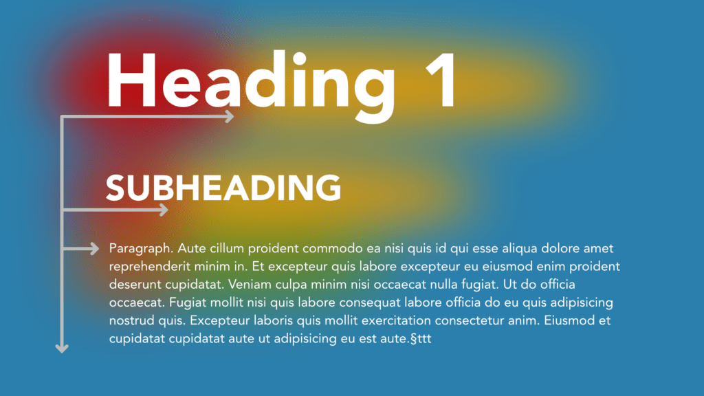
This lines up neatly with decades of eye-tracking research from the Nielsen Norman Group, which shows that visitors scan a webpage in an “F-shaped” pattern — a fast horizontal sweep across the top of the content, then a second, shorter sweep further down, then a drop down the left edge. Nielsen Norman Group, “F-Shaped Pattern of Reading on the Web,” In other words: your headline, sub-headline, and the first line under them are doing almost all of the work of convincing someone to stay.
What this looked like in practice
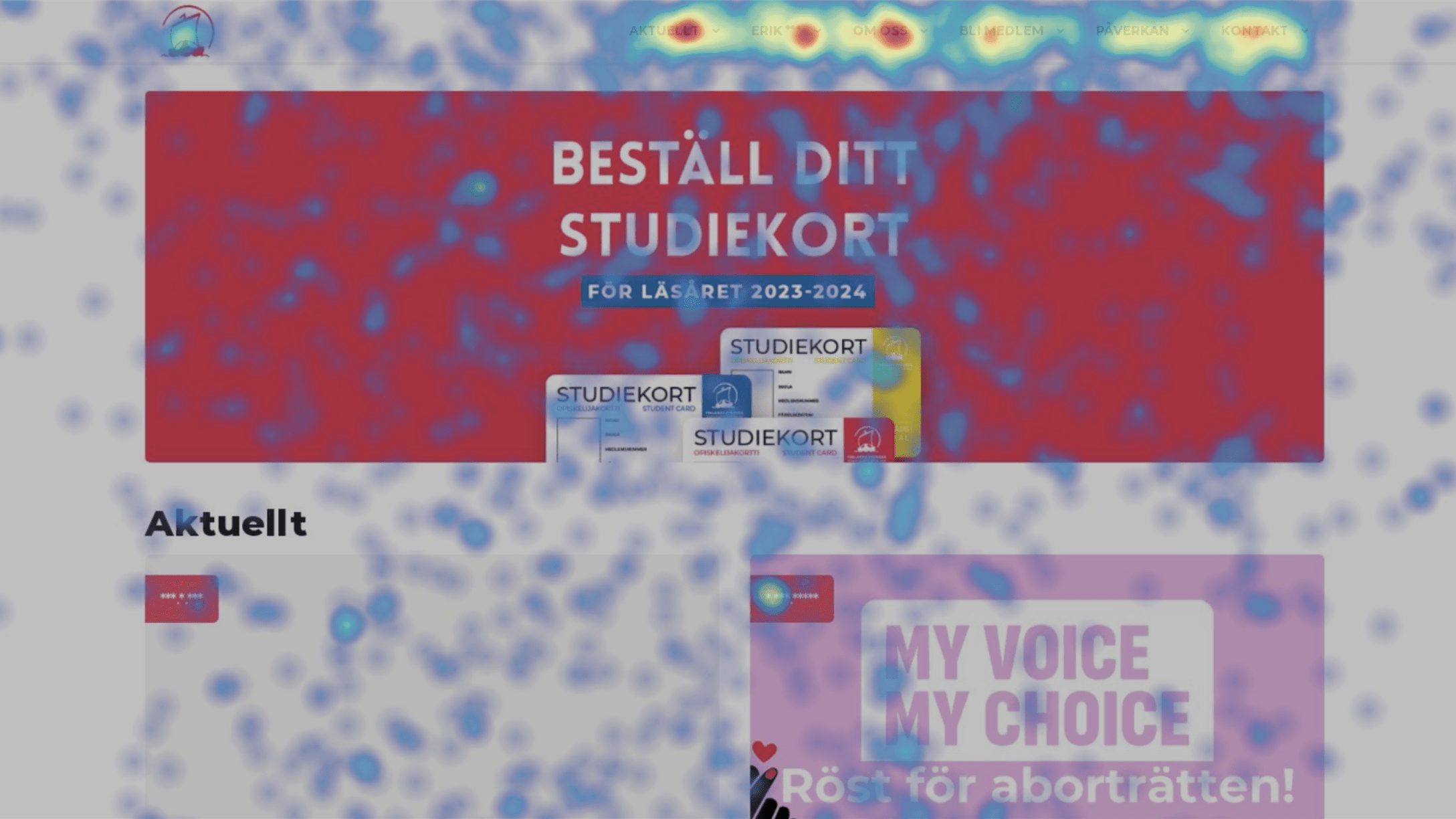
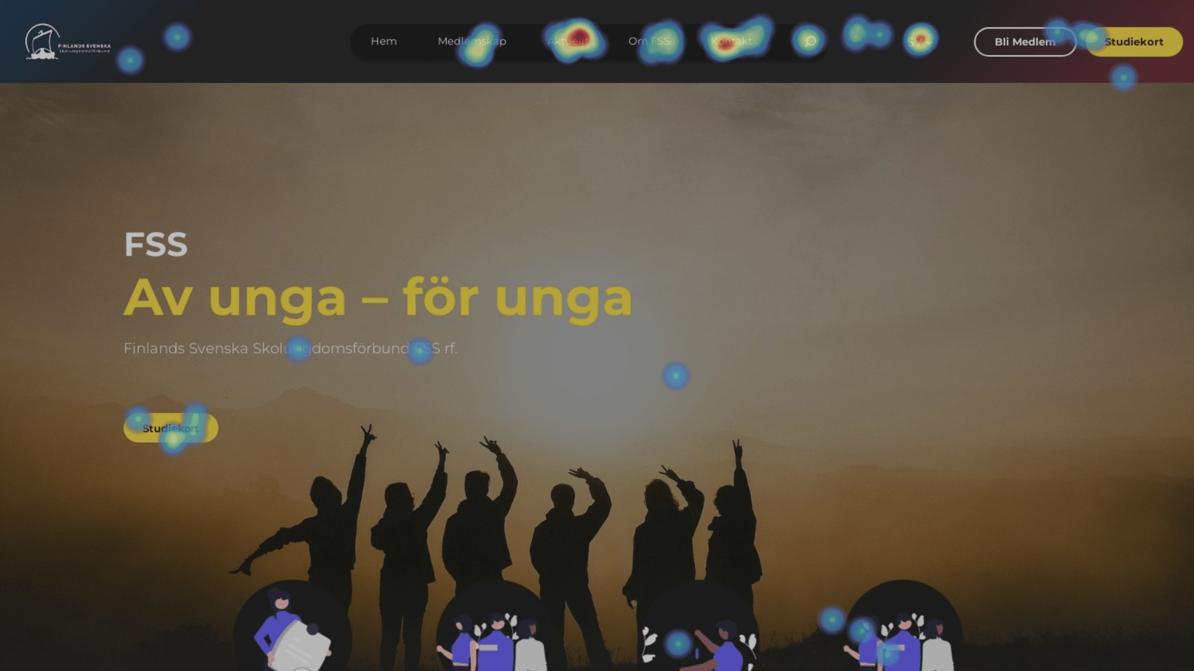
The FSS case study is a good illustration of why this matters beyond theory. On the association’s old website, heatmap data (collected via Hotjar) showed a lot of clicks landing on empty, non-interactive parts of the page — a strong signal that visitors were confused about where to go and what mattered. After the redesign consolidated navigation and restructured page content to front-load the key message, click behavior became far more concentrated on the three things visitors actually came for: membership information, current news, and contact details.
The organization’s staff also reported a very concrete downstream effect: after launch, the number of invalid or mistakes in membership applications dropped by roughly 70–80%, because the redesigned application flow put the necessary instructions in front of users before they could skip ahead to the form.
That’s the real payoff of designing for the “filter” moment — it’s not just about aesthetics, it’s about whether people successfully do the thing they came to do.
How to design for the 8-second filter
A few practical takeaways, whether you’re briefing a designer or auditing your own site:
- Say the real thing first. Lead with the actual value proposition, not a vague tagline. “Book a table in 30 seconds” beats “Welcome to our restaurant.”
- Give visitors a value snapshot immediately under the headline. A short, bolded line that summarizes what the page is about — placed exactly where the eye lands first — does a lot of heavy lifting.
- Design for the F-pattern, not against it. Put your most important words at the start of headlines, subheads, and bullet points, since that’s where the eye actually goes.
- Cut the noise around your main message. Every extra menu item, banner, or competing call-to-action dilutes the few seconds you have.
- Be genuinely specific. Authenticity, per the research above, is one of the three things people are unconsciously judging — vague corporate language reads as inauthentic almost instantly.
The takeaway
Attention spans haven’t collapsed to eight seconds. But patience for a confusing, unfocused website absolutely has a short fuse — and that fuse is lit the moment someone lands on your homepage. The sites that win aren’t fighting biology; they’re just removing the friction between “what am I looking at?” and “oh, this is exactly what I need.”
Thinking about whether your own site passes the 8-second filter? At Limebay Media, we start every project with evaluating these things — real data, experience and no guesswork — Get in touch if you’d like a second pair of eyes on yours.