FIKA matchabar is a startup coldbrew- and matchabar in El Progreso, Honduras, founded by my sister-in-law. LimeBay Media helped shape the brand in forms of some social media content as well as a branding package, inspired by the name FIKA, which, in turn, is inspired by the swedish concept of fika.
The concept of fika is more than just having a coffee – it is a social break and a time to relax in the midst of the everyday stress. This was something we wanted to capture in the overall brand of FIKA. The logo, resembling a deer with a calm and relaxed facial expression.
Why the deer?
When designing the brand, we looked into various animals and figures that could act as a brand mascot. We ultimately chose the deer for two main reasons. The first one being its connection to the swedish nature, being a peaceful, majestic animal commonly found in the swedish (and nordic) countryside. Secondly, we chose the deer for its symbolism in the Bible. As both LBM and FIKA are companies rooted in the chritsian faith, we wanted something that connects the brand to the word of God.
“As the deer pants for streams of water, so my soul pants for you, my God.”
Psalms 42:1
While we might pant for water (or in this case, Coffee and Matcha), we want to remember ourselves and FIKA’s customers that we also need other nutrients than what this world can give us – nutrients that is only available thrugh God.
Make sure to follow FIKA on instagram, @fika.matchabar


This shoot was not in a very usual location (for me at least). While visiting my now Wife in her home country Honduras, I was asked if I could take some promotional pictures for a local restaurant, which I gladly did. Always pleased to help small businesses no matter where I go!
When I started my journey in photography I tried pretty much all the free alternatives for editing raw photos. But it just so happened that while I was stepping up my photography game, I had access to Adobe’s Lightroom through my workplace subscription. Therefore, I got used to using it for both work and my own company. And I loved it. I’ll be the first to admit, I do like Adobe’s products – However, I do not align with their philosophy regarding AI and pricing structure.
That’s why once I quit my old job, I started to look elsewhere for alternatives. Ultimately I landed on Luminar Neo, which I actually already had a perpetual license for laying around. But somehow, over the years I’ve been using it ever since, it never felt quite right. It felt like some things were missing, coming from the LR experience and the way It makes edits in a linear “stacking” way, not being able to edit previous settings without temporarily discard newer ones, never felt intuitive or effective. And let’s not even speak about the performance of Luminar Neo, requiring hours to export large batches of photos, and frequent restarts due to errors and images getting stuck loading indefinately.
Then I saw the light…
… when one evening I saw a video pop up in my YouTube feed. The video named “Free Lightroom Clone… Try This NEW Alternative…” by *Tony Photo Pilot,* immediately caught my attention.
The video presented a new, lightweight raw editor, needing nothing more than a folder of images to work. No database, no proprietary library, just raw files and xmls. Weighing in at a size of only 78,8 MB in size, it felt too good to be true.
It would take a few weeks for me to finally be able to try it out for myself, but when I did, oh boy was I delighted. Blazing speeds, an editing workflow much similar to Lightroom and a clean, simple yet powerful UI. The edits I would have spent about 5 minutes on in Luminar was now done in about a minute in RapidRAW.
What about AI
I know what you’re probably thinking… Yes, RapidRAW does contain a bunch of AI features, just like Lightroom, Luminar and most other big editors nowdays. It is also highly probable that RapidRAW itself is built by/with the help of AI. Based on the software’s own website, getrapidraw.com, it took mere weeks from idea to first release. All this by a single, independent developer, I find it hard to believe RapidRAW would be built without the help of AI. We get no official statement on this, as far as I have found, but honestly, I don’t mind. A software that helps photographers world wide, providing extraordinary editing experience for free to everyone, is great no matter AI is involved or not. This is of course up to personal opinion, but I would argue that there is no issue, as long as this software stays free/donation supported.
Usage and features
I’m not gonna waste time explaining and listing all features and the entire experience in great detail. Instead, just try it yourself. The app takes seconds to download, literally.
Read more about the RapidRAW project over at getrapidraw.com
Note: LimeBay Media is by no means related or connected to RapidRAW or their developer. This is purely my own opinions and a way to spread the word about software I believe in and like myself.
Another topic discussed in my 2024 thesis, The FSS redesign also moved to a dark, high-contrast background, which is a decision the thesis ties to a broader shift in user preference toward dark interfaces, alongside a deliberate goal of moving away from the “sterile,” overly clinical feel of the previous all-white design.(Jephthah, N. (2024), “Implementing Dark Mode in Web Design,” )
It’s worth being precise about what dark mode does and doesn’t do, since the claims around it get exaggerated online:
- Battery life on OLED/AMOLED screens is a real, measurable benefit — because these displays can turn individual pixels fully off for true black, dark interfaces can extend battery life meaningfully on phones and OLED laptops (LCD screens, which use a constant backlight, see little to no benefit).(Superhuman, “Benefits of dark mode: What research reveals in 2026,”)
- Eye strain claims are more nuanced than most marketing suggests. Users frequently report less eye strain in dark mode, especially in low-light environments, and it’s the single most common reason people give for preferring it.(Nielsen Norman Group, “Dark Mode: How Users Think About It and Issues to Avoid,”) That said, the American Academy of Ophthalmology has been clear that there’s no strong scientific evidence dark mode actually protects eye health — the comfort is real, but “reduces strain” and “prevents damage” aren’t the same claim.
- It’s a genuine visual differentiator. In a sea of similar-looking light backgrounds within any given industry, a well-executed dark theme (paired with a small, purposeful color palette) tends to stand out — and read as more modern.
Getting dark mode right (without hurting accessibility)
A few things worth getting right if you’re considering a darker palette:
- Avoid pure black (#000000) backgrounds. Most current UI guidance favors a dark charcoal or near-black (something like #121212) over true black, both for readability and to avoid “smearing” artifacts on some OLED screens.
- Keep contrast within accessibility guidelines. Dark backgrounds with light text still need to meet WCAG contrast minimums — high contrast doesn’t automatically mean correct contrast.
- Limit your accent colors, don’t multiply them. A dark background makes every bright color you place on it louder — which is exactly why the FSS site used its accent colors (red, yellow) sparingly rather than throughout.
- Offer a light/dark toggle where your audience is mixed. Not everyone prefers dark interfaces, and for some visually impaired users, light-on-dark text is genuinely harder to read.
The takeaway
Choosing (or rethinking) your website’s color palette? Limebay Media builds color systems around what a brand actually needs to communicate — not just what looks nice in isolation. Get in touch if you’d like a second opinion on yours.
You’ve probably heard the stat: thanks to smartphones, humans now have a shorter attention span than a goldfish, these days it is said to be only about eight seconds. It’s been repeated in marketing decks, LinkedIn posts, and conference keynotes for the better part of a decade.
There’s just one problem: it isn’t true. But something closely related to it is — and it has real, measurable consequences for your website.
The goldfish myth, debunked
The “8 seconds, shorter than a goldfish” claim traces back to a 2015 Microsoft Canada report, which sourced the number from a company called Statistic Brain. When the BBC investigated the claim in 2017, it found that Statistic Brain couldn’t produce a credible original study behind it, and Microsoft quietly pulled the report from its site.
Fast Company, “8-second attention span is BS. This is why,” 2024
Even the goldfish comparison falls apart under scrutiny — research on fish cognition suggests goldfish memory and attention last considerably longer than nine seconds.
The bigger picture backs this up. People binge entire seasons of television in one sitting, read novels for hours, and stay focused on demanding tasks for well over an hour when the task holds their interest. Forbes, “Science Shows: Humans Have Massive Capacity For Sustained Attention,” 2023, Attention hasn’t shrunk. It’s gotten pickier.
So what actually happens in the first few seconds?
Here’s the part that’s easy to lose in the myth-busting: even though there’s no fixed 8-second ceiling on human focus, there is a very real, very fast filtering moment that happens when someone lands on a webpage — a near-instant judgment about whether it’s worth their time at all.
This is the idea my 2024 Arcada University of Applied Sciences thesis builds on. The thesis — a practical case study on redesigning the website of the Finlands Svenska Skolungdomsförbund (FSS), a Finnish youth association — draws on marketing research describing an “eight-second filter” Gen Z visitors apply to new content, weighing three things almost instantly:
Lindvik, F. (2024). Optimering av hemsidor för behållen uppmärksamhet – Webbdesign för Generation Z. Degree Thesis, Arcada University of Applied Sciences. ; citing Patel, D. (2017), Forbes, and Finch, J. (2015), Fast Company
- Authenticity — does this feel genuine, or like generic marketing filler?
- Perceived value — is this worth my time (or money)?
- Relevance — does this actually speak to something I care about?
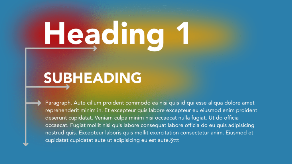
This lines up neatly with decades of eye-tracking research from the Nielsen Norman Group, which shows that visitors scan a webpage in an “F-shaped” pattern — a fast horizontal sweep across the top of the content, then a second, shorter sweep further down, then a drop down the left edge. Nielsen Norman Group, “F-Shaped Pattern of Reading on the Web,” In other words: your headline, sub-headline, and the first line under them are doing almost all of the work of convincing someone to stay.
What this looked like in practice
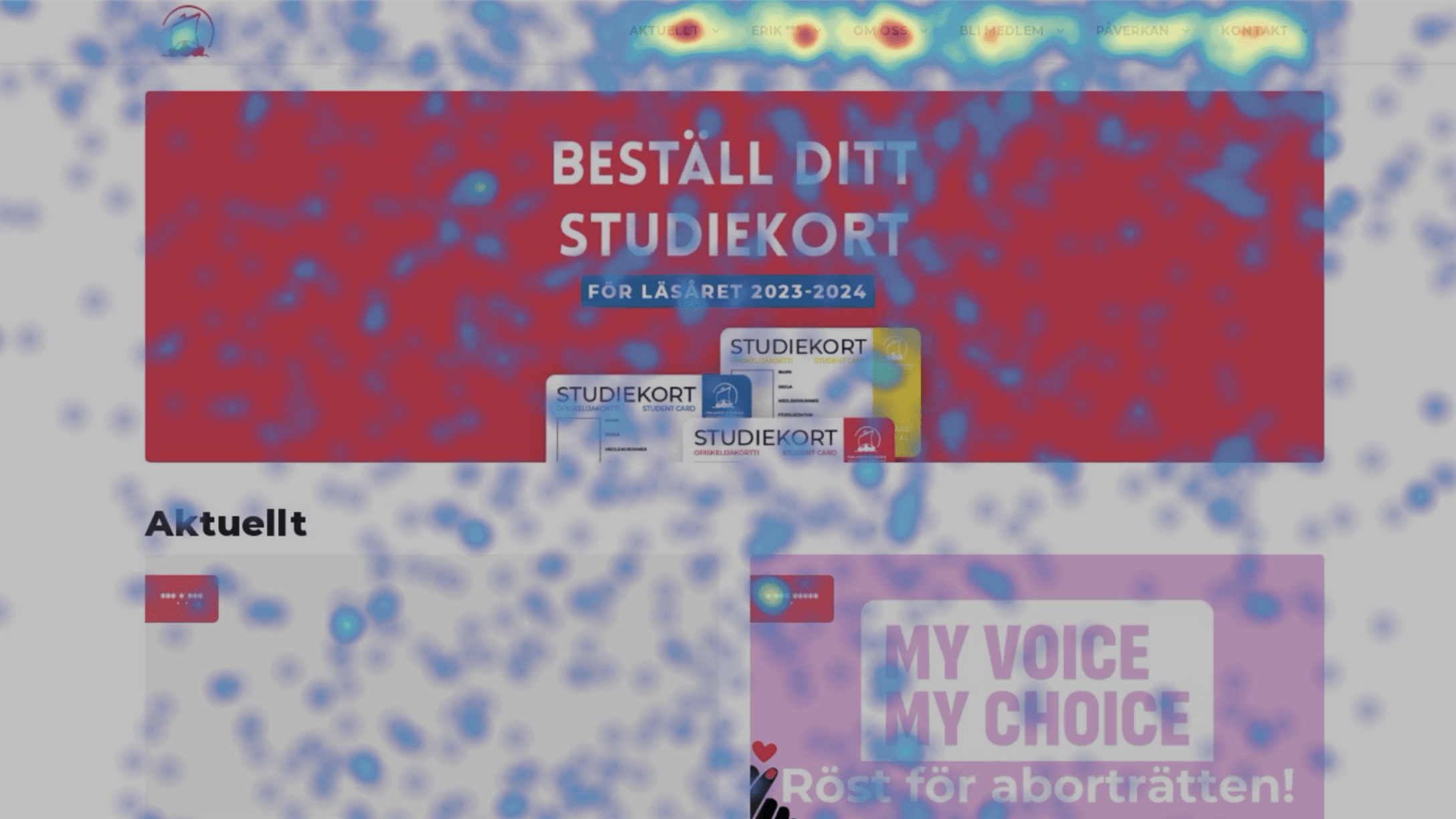
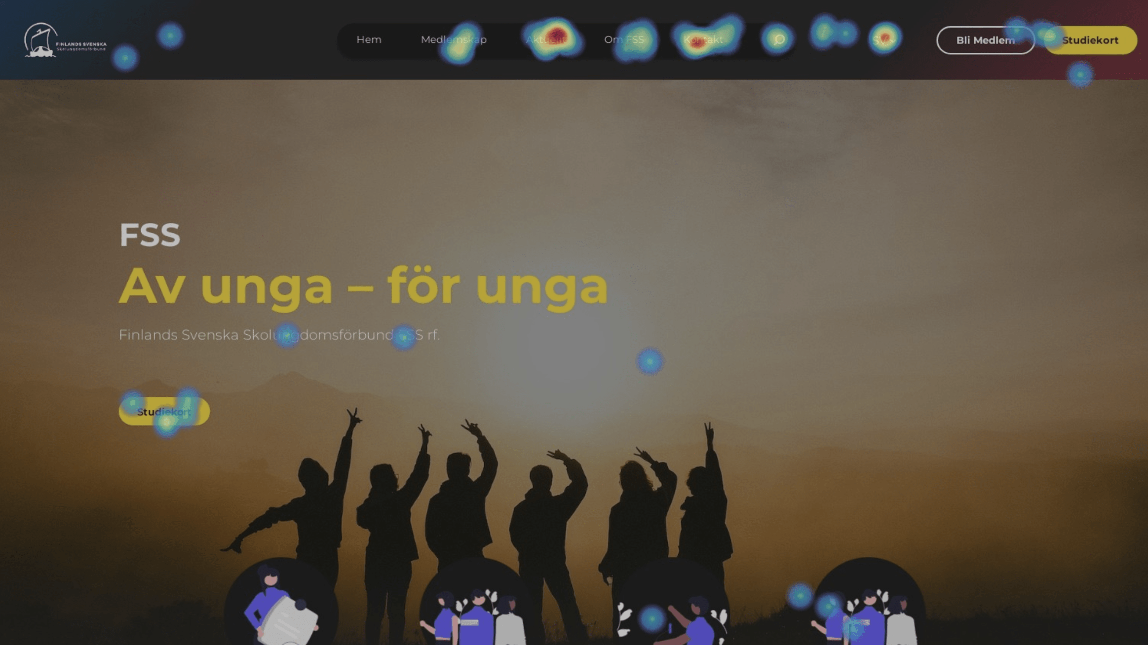
The FSS case study is a good illustration of why this matters beyond theory. On the association’s old website, heatmap data (collected via Hotjar) showed a lot of clicks landing on empty, non-interactive parts of the page — a strong signal that visitors were confused about where to go and what mattered. After the redesign consolidated navigation and restructured page content to front-load the key message, click behavior became far more concentrated on the three things visitors actually came for: membership information, current news, and contact details.
The organization’s staff also reported a very concrete downstream effect: after launch, the number of invalid or mistakes in membership applications dropped by roughly 70–80%, because the redesigned application flow put the necessary instructions in front of users before they could skip ahead to the form.
That’s the real payoff of designing for the “filter” moment — it’s not just about aesthetics, it’s about whether people successfully do the thing they came to do.
How to design for the 8-second filter
A few practical takeaways, whether you’re briefing a designer or auditing your own site:
- Say the real thing first. Lead with the actual value proposition, not a vague tagline. “Book a table in 30 seconds” beats “Welcome to our restaurant.”
- Give visitors a value snapshot immediately under the headline. A short, bolded line that summarizes what the page is about — placed exactly where the eye lands first — does a lot of heavy lifting.
- Design for the F-pattern, not against it. Put your most important words at the start of headlines, subheads, and bullet points, since that’s where the eye actually goes.
- Cut the noise around your main message. Every extra menu item, banner, or competing call-to-action dilutes the few seconds you have.
- Be genuinely specific. Authenticity, per the research above, is one of the three things people are unconsciously judging — vague corporate language reads as inauthentic almost instantly.
The takeaway
Attention spans haven’t collapsed to eight seconds. But patience for a confusing, unfocused website absolutely has a short fuse — and that fuse is lit the moment someone lands on your homepage. The sites that win aren’t fighting biology; they’re just removing the friction between “what am I looking at?” and “oh, this is exactly what I need.”
Thinking about whether your own site passes the 8-second filter? At Limebay Media, we start every project with evaluating these things — real data, experience and no guesswork — Get in touch if you’d like a second pair of eyes on yours.
Webdesign and copywriting for Replot Metall, a metal production company outside of Vaasa, Finland. Site built in Framer
A fictional design-concept. Built in ycode, an open-source alternative to Framer.
Ficitional project for portfolio purposes.
Background
During the spring 2024 I developed a brand new website for my current workplace Finlands Svenska Skolungdomsförbund FSS r.f. (Finland’s Swedish-speaking School-youth Association FSS). This project also served as my final production for my studies in Online Media at Arcada UAS.
Main Objectives
The main objective with this project was increased engagement, and clear commuinication. This was measured in relation to the Organization’s old website.
The known pain-points of the previous website was:
- High volume of Customer support-requests, in matters already described and covered by the website. Somehow the user base did struggle navigating the site to find these answers.
- Mistakes made in the member-application, while the instructions themselves were clear, it seemed to not catch the visitors attention before applying
- General confusion in navigating the site, found through analysis of user behavior while visiting the site.
The User behavior was observed using hotjar, a WordPress-plugin that analyzes user sessions and identifies pain points.
After having launched the new website we analyzed and compared the result to the old page. There we could observe a drasticly streamlined user experience/user journey based on hotjar-sessions and analysis, as well as a massive drop in both customer-support questions and mistakes in the application process.
Technical
The website is build in WordPress using the built in Block-editor / Full-site editor. Follow-up work will be done on the site during fall 2024 and with that we’ll be analyzing the results and user behavior statistics in comparison with the previous site.
The live site can be visited at the address skolungdom.fi
Rento is a fictional Company used for portfolio purposes.
This landing page protoype is made in Framer.
A talkshow-styled video made for my Church’s youth-ministry. While many people was involved in this production, I was in a managing position being responsible for planning, overseeing scripting, as well as serving as the A-Camera operator and head video editor.
Smartaccom is a fictional smart hotel service focusing on flexibility and rethinking hotel accomodation.
This site protoype was made in Figma and served as the final asessment in one of my UX/UI courses at university.
Bygg på Klippan is a campaign-site for the renewal of SLEAF’s campyard Klippan’s accomodation cabins. The page aims to gather all relevant information for individuals and organizations of how these can help fund the project.
The entire site is built purely within the main site slef.fi, making use of separate Elementor-templates to differentiate the look from the main site.
During my time at the University, I was involved in renewing my student’s unions webpages, carrying out a rebuild of their poorly aged WordPress page.
This work was made 100% pro-bono and taught me a lot about redesigning an existing WordPress site without removing or damaging old posts, adapting pages to new layouts as well as user-login experiences and login-restricted areas.
The more advanced page-layouts are built in “Beaver Builder”, whereas the simpler pages and posts in particular uses the old WP post-editor (non Gutenberg/Block-editor)
American bluegrass gospel night (or ABGN in short) is an event for the entire family. Apart from the main attraction, bluegrass gospel bands and artists from all over the world, the venue offers activities for all ages. Walk along the western-street consisting of cafes, blacksmiths and stores, grab a burger from the grill, ride horses and try your luck while panning for gold. 2023 was the fourth edition of this beloved event held at the camp area klippan, outsite of nykarleby in finland.
The event is organized by SLEAF (Swedish Lutheran Evangelic Association in Finland) and run by volunteers of all ages. This year i was one of the event photographer- / videographers.
Especially during the spring months and into early summer, there is usually a lot of celebration of graduations, students, confirmations and more. Most people want to have a photo for remembering their special day. Here’s a selection of the many graduating students and more that I’ve had the honor to photograph over the years.
Tim Worthington is a fictional character made up for the sake of a course where the goal was to create a complete brand design for a (fictional) company.
Medical Beauty Station is a beauty salon located in Kauniainen, the neighbouring city to Helsinki, Finland. During the winter 2022-2023 a team of gathered resources from LimeBay Media and Storm Photography gave their websites a total overhaul and rebuilt their page from the ground up. The main focus was to increase traffic to the site and customers to the salon. We also put a lot of effort in makin the backend as simple as possible to use. We also put a lot of effort into making the site visually pleasing and produced a lot of the visual material ourselves.
The site is built in WordPress in a heavily modified version of the Astra theme, Beaver Builder. Custom developed menu systems and a custom-post-type system was built to ease the process of inserting and sorting info about the treatments they offer.
The live website has since been replaced by the client during a later aquisicion.
Sometimes all you need is a minimalistic, simple yet good looking portrait. Maybe it’s of your company’s employees or for your CV – a simple, professionaly taken portrait can always be good to have!
Vasa Nation is a student-union for students in Helsinki coming from the areas around the city of Vaasa, also known as the Ostrobothnia region in Finland. Every year the Union calls their members to a festive celebration in order to celebrate together. This year I’m serving as the Photographer on all the union’s events, and so I got the opportunity to photograph this beautiful night of celebrations.
Alive was a musical show performed by the women’s choir Nonen Vocals based in Vaasa. This concert was my first concert-gig as a photographer and an immense learning experience. I got to participate during both shows as well as rehearsals, giving me access to angles and images that wouldn’t have been possible had there been an audience in the room.
In A Pickle is a Finnish cooking and recipe site and production company. I’ve had the honor to assist on photoshoots, edit video material for the company’s various clients, such as the Finnish meat producer Snellman amongst others. I’ve also had the opportunity to direct and shoot some of in a pickle’s material myself, ant the result is shown here.
As a part of my work with In a Pickle, I helped in creating and editing content for their clients. Thanks to this, I’ve gotten to edit multiple instagram reels for the big Finnish meat producer Snellman. The reels were produced for use on satokausikalenteri’s social media but also got posted on Snellmans own socials.
Delights By Neela is a small, single person company that makes various vegan goodies and treats, such as pralines, cakes, fudges and much more.
The website delightsbyneela.fi is the first real website I’ve developed for a client. The page is built on WordPress but all visual design is done completely from scratch. Thanks to the shop-plugin WooCommerce, together with some tweaks to said plugin, we were able to implement a way of showcasing the various products without the ability to order and shop the products online, per the clients request. This function is easy to add back in in the future if the needs were to change down the road.
The focus has been on ease of use while keeping a clean and simple visual style. The instagram feed and the four most recent products gives an extra dynamic touch to the otherwise quite static start page .
You can visit the page here: (Swedish and Finnish)
delightsbyneela.fi
A you might’ve seen I have happened to shoot a fair bit of squirrel photos. This is thanks to squirrels being very friendly and easy to spot in the area where I live. Here’s my all time favorite pictures of these furry, adorable animals.
If you want to know more about the story behind these images, check out my blog-post about them HERE !
Hamnboden is an idyllic little kiosk located in the guest harbour of Replot, where I grew up. Hamnboden serves the tastiest hamburgers in the area together with delicious, big ice cream portions. They also rent kayaks and SUP-boards and handles the customer service for the guest harbour.